
When Nike and Oregon State University unveiled the school’s new logo and uniform designs earlier this month, they explained the ideology of the streamlined beaver in a press release:
It’s not clear how a design element can be both “deliberate and fast,” but excusing that for a moment, the new look marked the final point on the O.S.U. Beaver’s evolutionary timeline: from its glory days of bucktoothed friendliness, to a middle period of mere feistiness, to the current version, perfected for the wind tunnel and with hate in its eyes.
The Beavers men’s basketball team, coached by Obama’s brother-in-law Craig Robinson, didn’t make this year’s N.C.A.A. tournament. Among the logos and mascots of the sixty-eight teams that did, there is, save for a few holdouts, a bland field of angry beasts promising to bite, scratch, or otherwise disembowel their opponents. Call it the fierce-ification of college mascots: bulldogs mug, wildcats snarl, eagles screech. Across all levels of college sports, normally tame (or, at least, not murderous) creatures have gone wild. The Saint Peter’s Peacock was formerly sassy; now it looks primed to maul its handler. The Pomona Sagehen once looked kind; now it looks pissed. And even the Jumbos of Tufts have a logo that looks poised for a rampage, despite bearing the name of the sweetest elephant the world has ever known. Blessedly, Santa Cruz’s Banana Slug continues its life as a smiling bookworm—may it never have its copy of Plato replaced with a sword.
Convention seems to have it that a fierce logo will somehow inspire the same quality in the athletes that wear it on their uniforms. Yet there is something to be said for logos and mascots that boldly go in the opposite direction—ones that embrace eccentricity or good humor, or harken back to a time when college sports were just another form of intramural mischief. On the eve of the Sweet Sixteen, we’ve categorized and ranked the surviving teams, with an eye toward tame and gentle logos, nicknames, and mascots.
Fierce and Forgettable Creatures
The jubilant upstarts from Florida Gulf Coast University may have won the nation’s heart, but their eagle mascot is decidedly uninteresting. Joining them in this group are the Louisville Cardinals (vengeful), the Arizona Wildcats (hungry), and the Marquette Golden Eagles (masking a shameful past, and currently too boring to be given a description).
The Angry Grain
The Wichita State Shockers have a nickname that seems specially designed for its role in upsets of higher-ranked teams during March Madness. Their logo, a sweater-wearing bundle of wheat, wins points for regionalism and originality, but loses them for resembling the deranged Chucky doll from “Child’s Play.”
Incongruous Francophilia
There is a lot to like regarding the iconography of Duke, but the Blue Devil is a ridiculous mascot—superior-looking, vaguely insect-like, and yes, falsely fierce. Worse, as any alum knows, its provenance requires a tortured and somewhat embarrassing explanation: “Well, les Diables Bleus were a French infantry battalion during the First World War…” Being named for anything related to the French military is not a good thing.
Esoterica
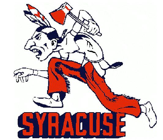
The Indiana Hoosiers are the among the boldest of the bold, having no mascot, and relying on an iconic combination of the letters “I” and “U,” both in red, for its logo. Good for them, except maybe a bit too precious. Also, while a Hoosier is the nickname for a resident of Indiana, it can also mean “an ignorant rustic.” The Michigan Wolverines could also be filed under the Fierce and Forgettable Creatures category, but their logo is essentially just the letter “M” in a “maize and blue” color scheme (which, to the rest of the country, is simply yellow and blue). The Syracuse Orange have an appealingly un-fierce mascot, but their color identity, like several other schools, is mainly an attempt to obfuscate a grotesque and racist past.
Weather
The Miami Hurricanes are named after a fierce and destructive weather event, something that only the unaffected could ever consider anything other than just plain awful. Naming a team after inclement weather is bad form—and makes for tough mascot decisions. Hence Miami’s Sebastian the Ibis, who, of course, is fierce.
The Top Six
The official symbol of the Florida Gators seems at first glance to have a disqualifying ferocity, but something about its total effect just seems drugged. And the school’s plushy mascot is surely more friend than foe, edging Florida into the top six.
The Michigan State Spartans have the best iconography of the schools remaining in the tournament. And though the Spartan mascot is semi-fierce, if anything deserves that designation, it’s a Spartan.
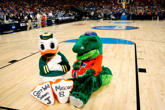
The Oregon Ducks deserve praise for their bird’s total tameness; they lose points because the mascot is actually Donald Duck.
Ohio State wins the flora award. No one would call a buckeye fierce—and Brutus, the team’s mascot, just seems pitiable and a bit confused. He’s not scaring anyone, except maybe Ann Arbor children in their dreams.
Despite the militant past of the term “Jayhawkers,” Kansas sports the best tame animal in the tournament—smiling, strutting, up for any number of good times. The Jayhawk has remained unchanged since 1946, and, thanks to the buckles on its shoes, is a throwback to an even earlier era. Its olde-tyme perfection is only marred by the bird’s resemblance to those racist-caricature crows from “Dumbo.”
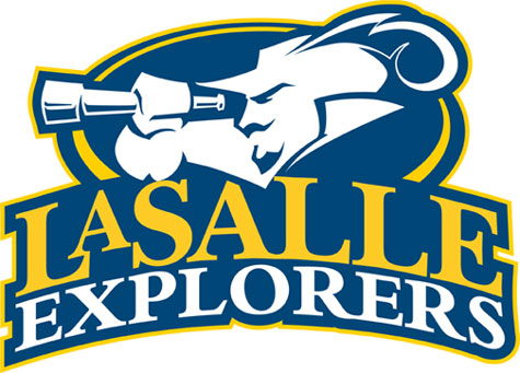
The logo of the La Salle Explorers would be at home in the Incongruous Francophilia category, save for the fact that it is not incongruous at all. They get their nickname from their school’s namesake, René-Robert Cavelier, Sieur de La Salle, the thin-mustached explorer of the Mississippi, lapsed Jesuit, and mutiny victim. The Explorers’ mascot looks like a member of the Village People, and could only be improved if he were given the curly, powdered wig that he surely deserves. La Salle also wins major points for having the only logo in the tournament that features a maritime telescope.

